

Juggling camera, backpack and a bag full of art cards! Gorgeous spring day — in the 60s — in a lovely neighborhood, full of old houses.
Besides PreRaphaelites, the Delaware Museum was hosting an exhibition of the great American illustrator, Howard Pyle, who taught N C Wyeth and a host of others. I’d seen some of these paintings on a previous trip at the Brandywine River Museum, to whose permanent collection they belong. However, there a great many I hadn’t seen, including wonderful ones rendered in black and white oils. The draftsmanship is superb. What a wonderful painter he was. I’m so drawn to illustration that I surely would have tried to become a professional illustrator if it was still in the publishing budget of periodicals and regular fiction. When I was growing up, I thought the ideal job would be to illustrate for National Geographic history articles. Photography has taken the place of illustration in magazines and no pictures at all has become the norm in fiction. Our imaginations are the poorer for it.
….but I was able to revel in the wonderful illustrations I saw a the Delaware Museum for an entire afternoon. Lucky me!
Before I get to Howard Pyle, I will post some of the non-PreRaphaelite works I saw. Get ready: there are a lot of pictures in this post!

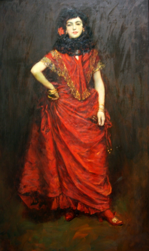
Portrait of the Artist’s Wife
This was the most impressive painting I saw at the exhibit, and it’s not famous enough for me ever to have seen it before. I’m sure the artist must have painted society portraits. This one is of his wife, who was an artist in her own right, an actress I think. It’s large and I was looking up at it when close. The texture and light of the fabric conveyed by the brushwork was amazing. I don’t remember the artist’s name; I should have been carrying a notebook or taking pictures of all the signage. You’d think I would have for this one.

Detail of drapery
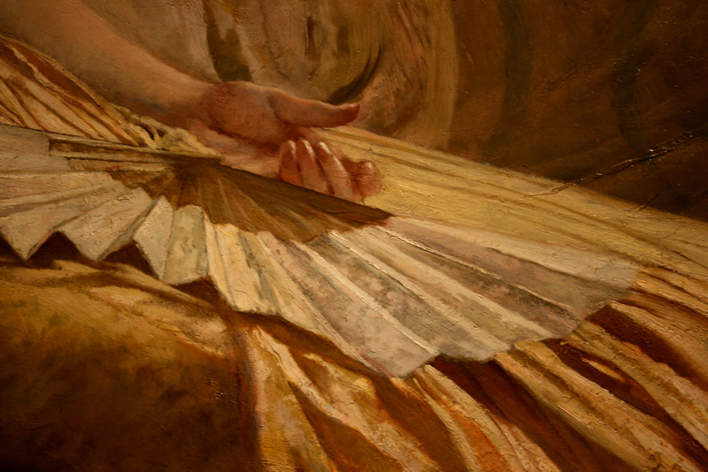
Detail of hand and fan
Famous paintings generally reward the viewer, when they finally see the real thing and aren’t looking at an art book, with the conviction that they are deservedly beloved. However, it’s my continual experience that the paintings by extremely skilled artists I’ve never heard of before are the ones that I’m blown away by at museums. I’m often most affected by how a painter paints and what I like the most are paintings that convey a very convincing realism, but are not rendered in such a way that the brushstrokes disappear. I LOVE oil paint. I love to look at it. Even when there are stunning sculptures or watercolors in the room, my attention will go immediately to the rich, glorious color and brushwork of oil paintings. This one was so rewarding to look at. Didn’t matter who the subject was. The artist rendered her beautifully. I wanted to grab handful of that skirt fabric; you could feel the weight of it just by looking!
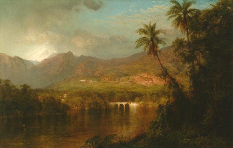
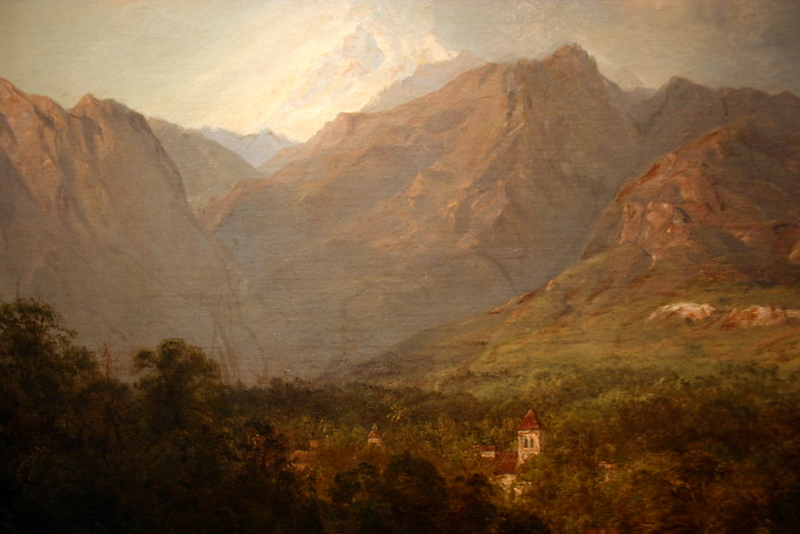
South American Landscape by Frederic Edwin Church, 1873

I’m sorry that I have no notes about this one
This one was by someone I didn’t expect, but little good it does me to remember that much about it, because I don’t remember who it was.
I love the way this one is painted. Can’t tell you who it’s by though.
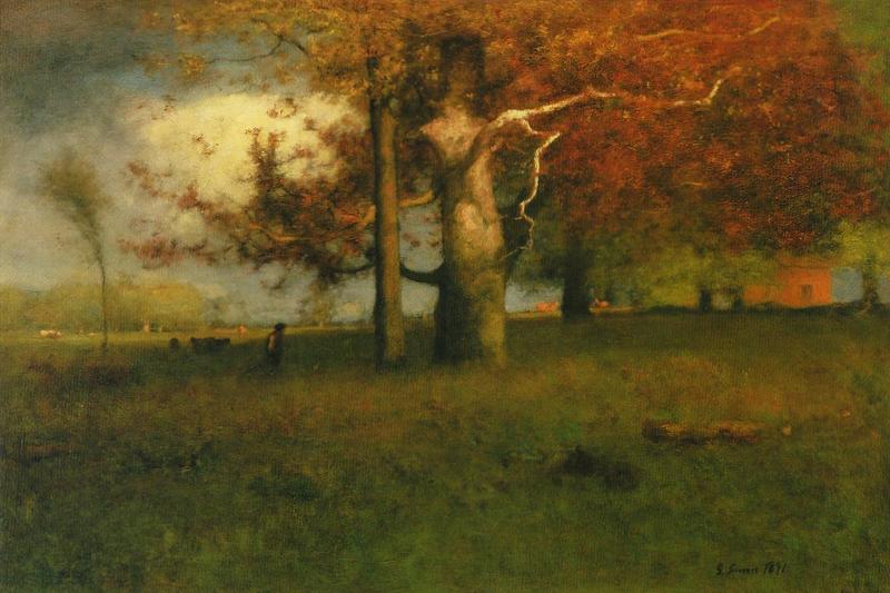
Early Autumn by George Inness, 1891
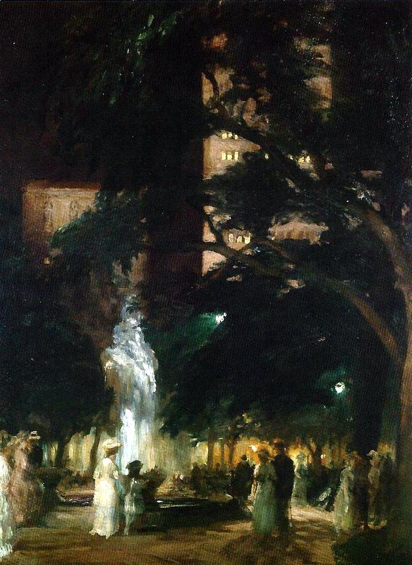
Throbbing Fountain, Night by John Sloan, 1908

Jefferson Market by John Sloan, 1917, 1922
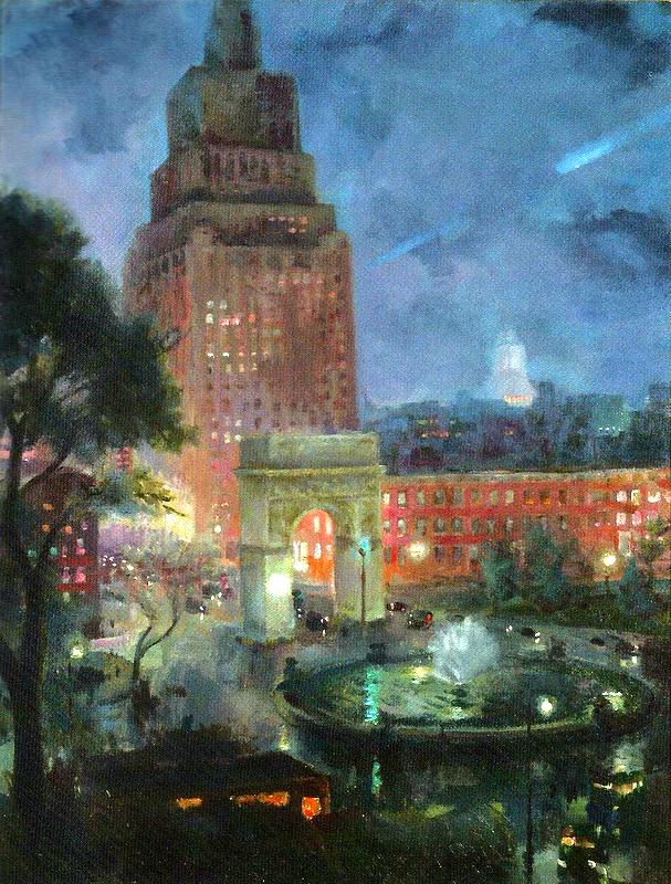
Wet Night, Washington Square by John Sloan, 1928
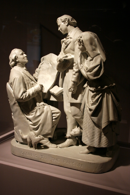
The above is a wonderful plaster sculpture. And now to Howard Pyle!
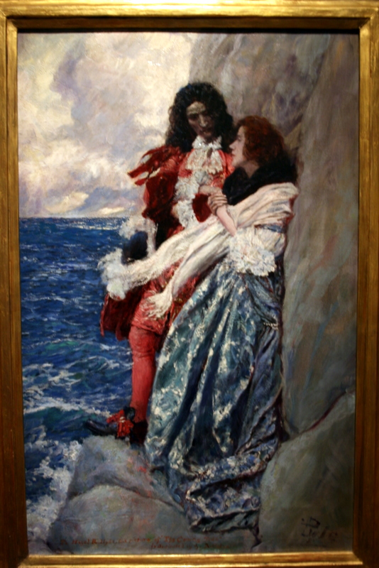
Who are we that Heaven should make of the old sea a fowling net? by Howard Pyle, 1909
I think this is my favorite of all Howard Pyle’s illustrations — though that is a very hard thing to choose — because it is so romantic and the colors and costumes are so gorgeous. I’d love to know what the story is about. It reminds me of Daphne du Maurier’s Frenchman’s Creek.
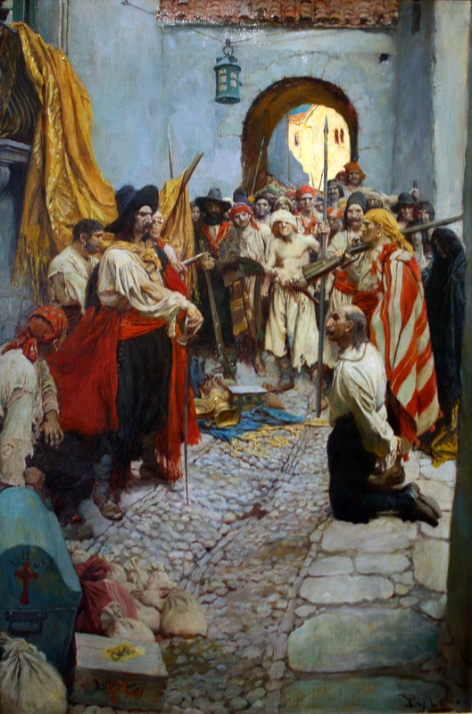
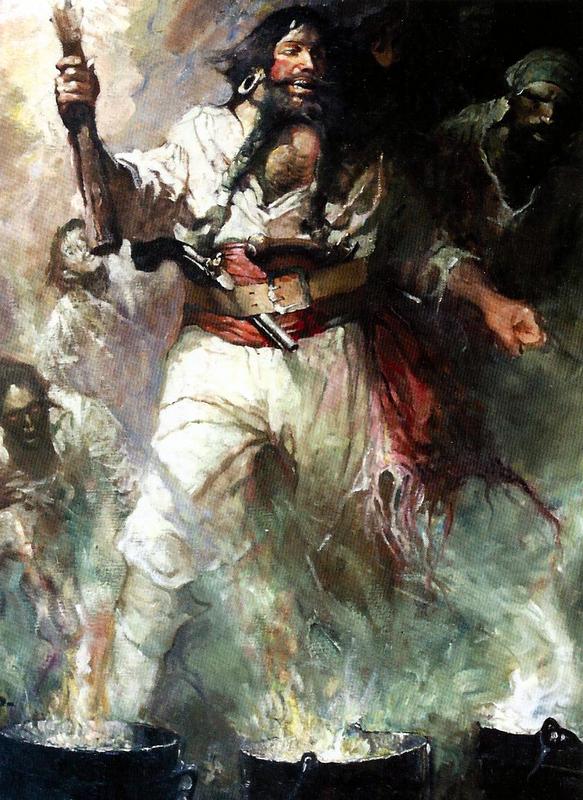
Extorting Tribute by Howard Pyle from Fate of Treasure Town
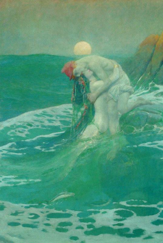
The Mermaid by Howard Pyle, 1910

So the Treasure was Divided by Howard Pyle, from the The Fate of Treasure Town, 1905
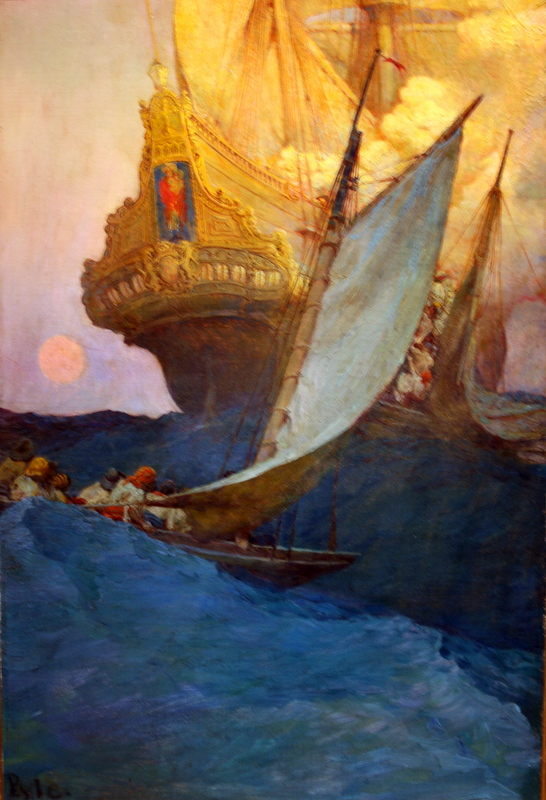
Attack on a Galleon by Howard Pyle, 1905
The Dancer from “Lola” by Howard Pyle, 1909
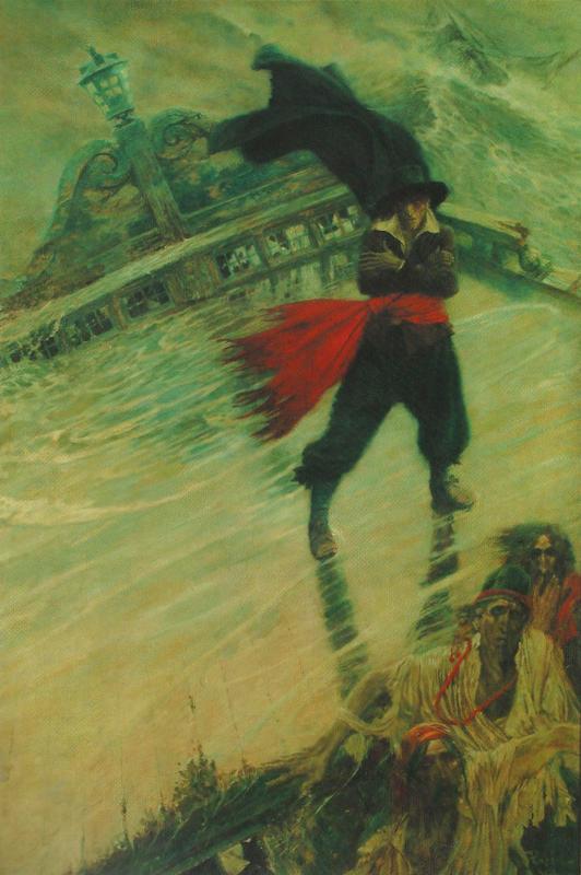
The Flying Dutchman by Howard Pyle, 1900
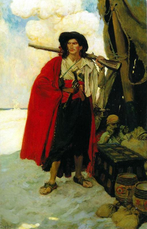
The Buccaneer was a Picturesque Fellow by Howard Pyle, 1905
I read at the Museum that Howard Pyle made up the original Pirate Costume. He needed to illustrate Pirates, so he came up with a costume that was then adopted by Hollywood and a host of other illustrators. This is so deeply impressed in our consciousness that we can’t imagine a pirate looking any other way, unless they are very refined pirates, like Captain Blood.
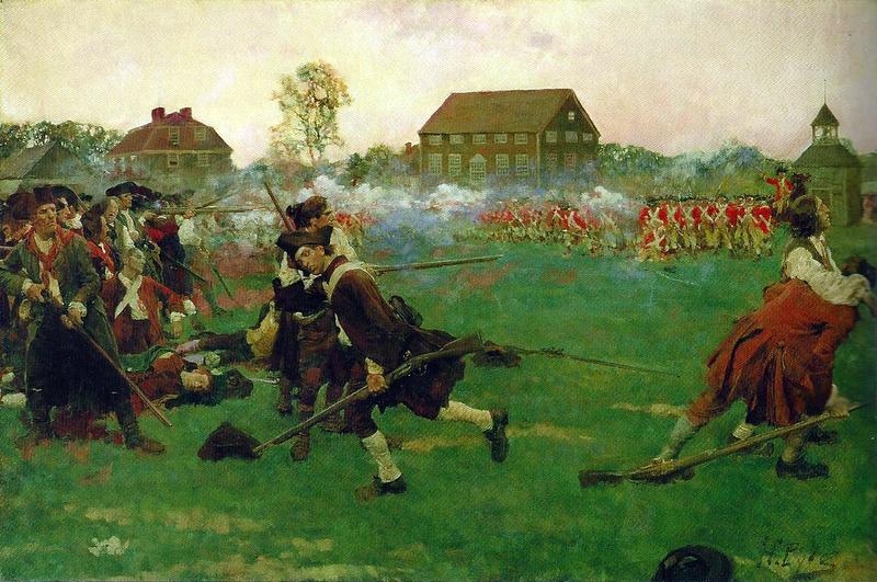
The Fight on Lexington Common, April 19, 1775 by Howard Pyle, 1897
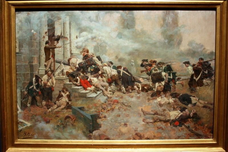
The Attack upon the Chew House by Howard Pyle, 1898
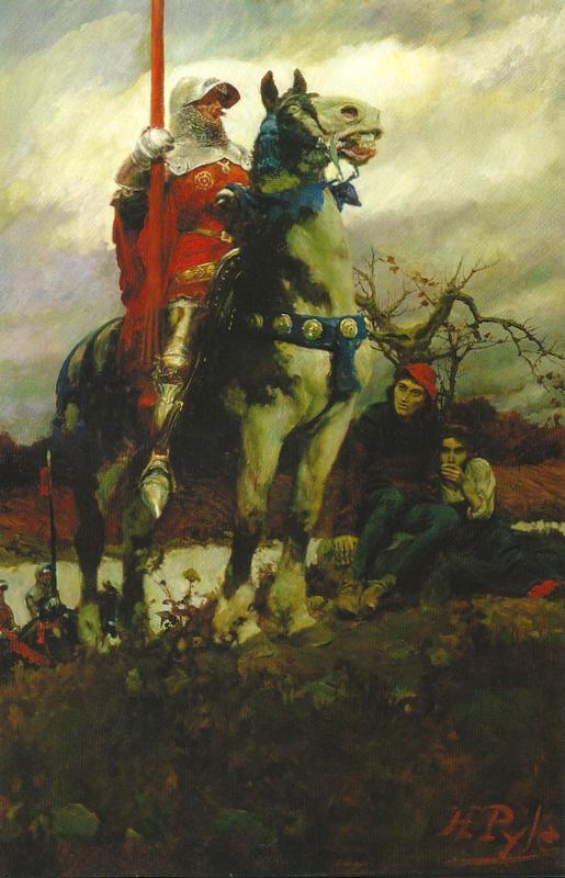
The Coming of Lancaster by Howard Pyle, 1908
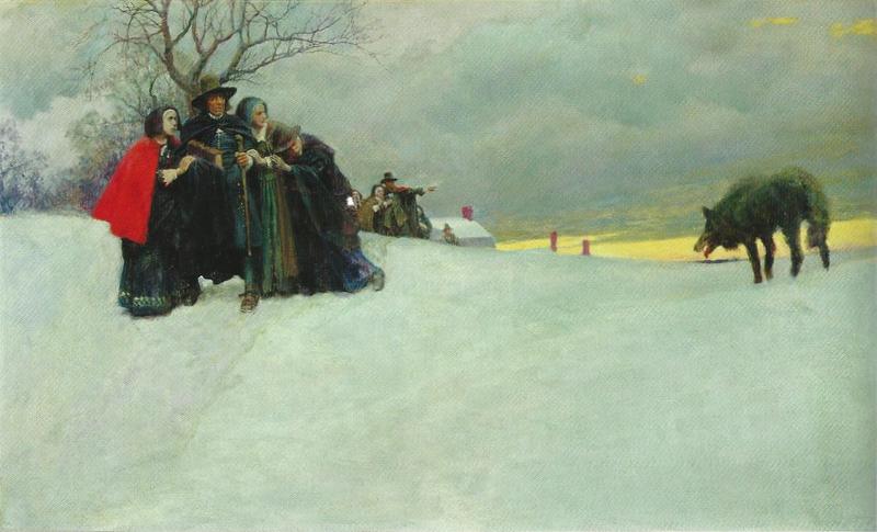
“A wolf had not been seen in Salem for thirty years” by Howard Pyle, 1909
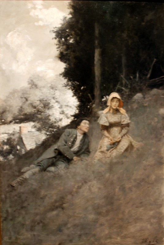
When the World Was Young by Howard Pyle, 1908
I quite like Pyle’s illustrations that are black and white or very faintly colored as much as the ones in full color.
Sorry that this one is a bit blurry, the fault of dim light and a wavering hand at the camera.
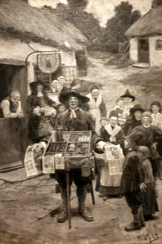
The Town Crier by Howard Pyle
I actually don’t know the proper name for this one and, again, it’s a bit blurry, but I find these illustrations so rich and detailed to look at, like old photographs, but so much better.

Dick Turpin by Howard Pyle — the hazy whiteness around the horsemen is me reflected in the glass.
- This was exciting, but I don’t remember what the subject was. Looks like a sort of Alexander/Buchephalus affair. The camera was very unfocused, I’m afraid.

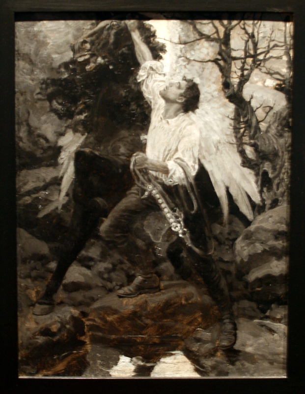
This was exciting. Looks like a modern day Pegasus / Bellerophon affrair.

Breton peasants in a storm
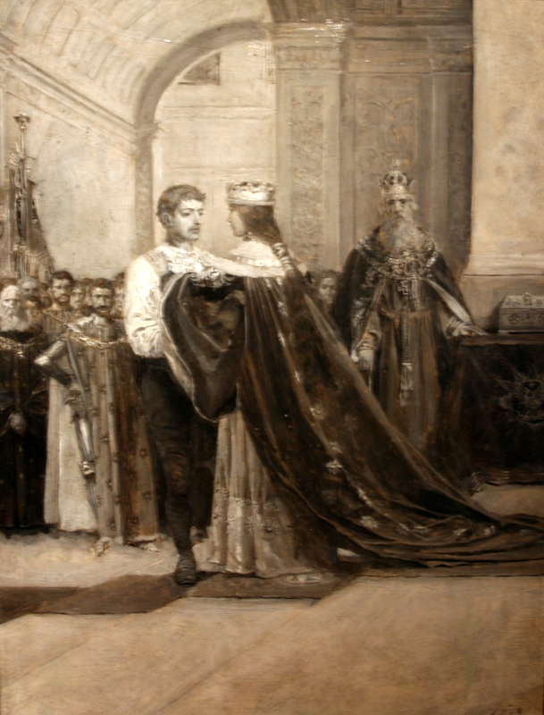
Don’t know what this one is about either.
Hey, but at least it’s not as blurry!
Besides Howard Pyle, there were a number of other illustrators. I like the one below particularly. It seems some callous wretch is about to abandon a woman in the mountains with her flat tire. Cad!
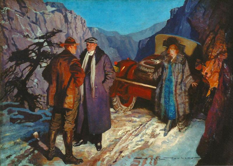
“You can’t leave here to suffer” by Gayle Hoskins, 1924 for Roads of Doubt
The Circus
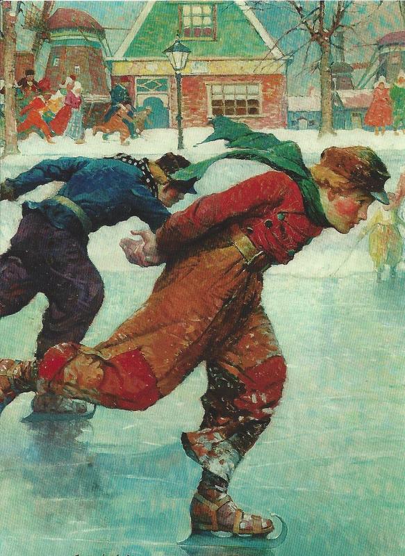
Hans Brinker, Frank E Schoonover, 1924

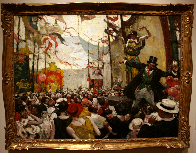
The PreRaphaelites go Hollywood
This is sort of awful, I think, but I totally get why they hung it.
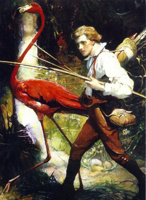
Boy and Flamingo by Frank E Schoonover, 1924
Now, what kind of adventure would a boy go on with a flamingo! My mind’s a complete blank. They look serious though. Maybe a bird rescue mission. Oh! It’s from The Swiss Family Robinson! I don’t recognize it, because I haven’t read it. Misspent childhood.

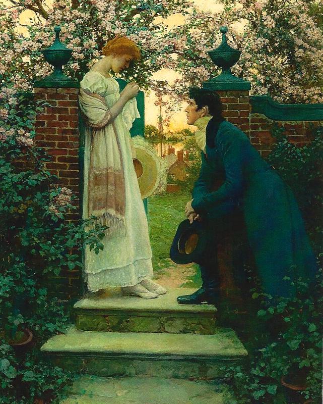
This painting of a serenade was lovely.
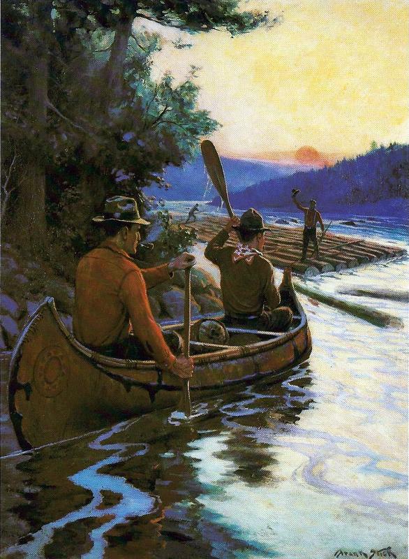
By Frank Stick
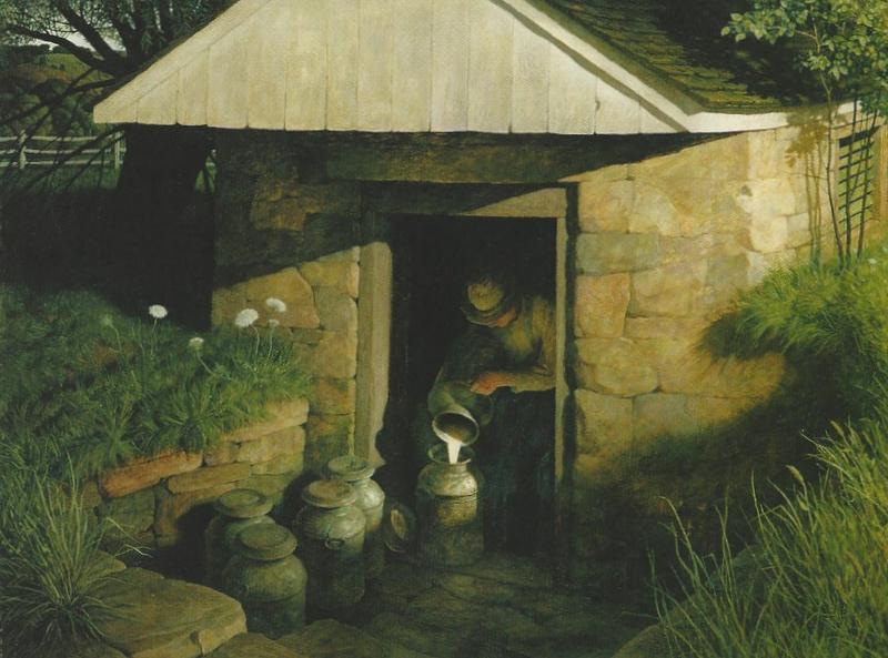
The Springhouse by N C Wyeth, 1944
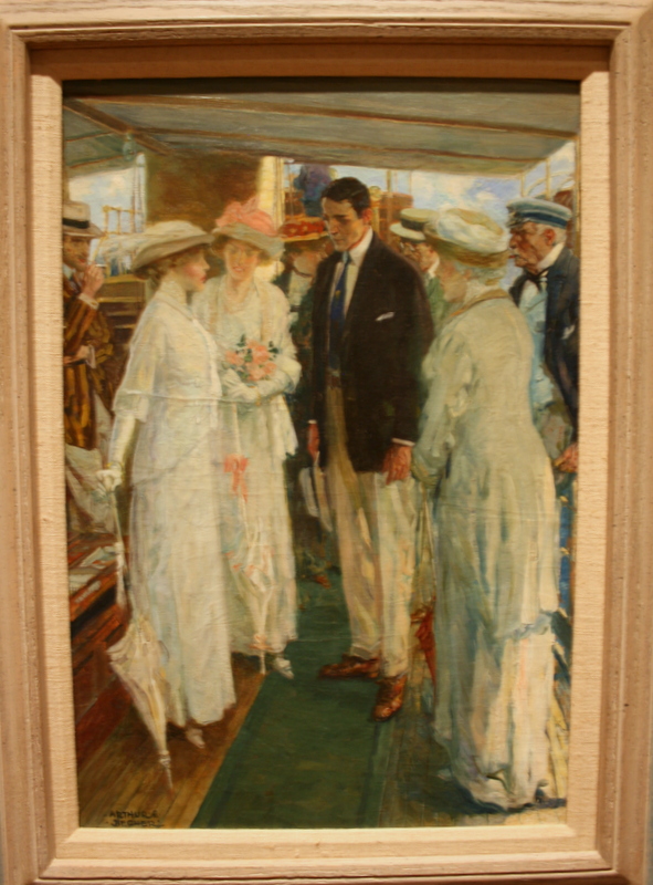
This collection looks rather… eclectic.
Way to many here for me to comment on, but “Portrait of the Artist’s Wife” is exquisite.
“When the World Was Young” Mr. Pyle seems to be drawing some inspiration from the pre-raphaelites himself? (I’m looking at the busy blossoms behind the girl’s head, and the detail in the stonework of the steps.) This picture almost looks as if it should fit in “The Secret Garden” somewhere, perhaps Mr. Craven and his wife, before the garden was shut up, or Mary and Colin when they are a bit older.
This is the same Howard Pyle that put together the “canonical” Robin Hood that we all grew up with, is it not?
“The Pre-Raphaelites go Hollywood” is awesomely awful. Except that it feels like a parody to me… I still wouldn’t want it on my wall.
“Boy and Flamingo” Swiss Family Robinson Indeed. Height and archery equipment make this Franz. (the youngest) You really have never read this?!? Please tell me you are going to rectify the oversight! I wish I could read this in the original, I sometimes get the feeling that some of the flavor was lost when a Victorian Gentleman, with his own cultural context, translated it.
Yes, some of your real life friends check the blog every now and then.
Lovely blog!
I’ll be back.
Margaretha